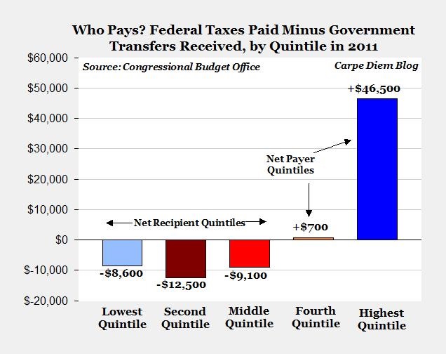
When you combine income, payroll, & excise taxes paid and then back out the transfer payments received, the top 20% of households paid an average of $46,500 in 2011. The second 20% paid a net of merely $700. The bottom 60% didn’t pay anything on net, but actually received back between $8,600 and $12,500.
That means the top quintile paid essentially all of the federal payroll and income tax net of transfer payments.
First the chart that illustrates this data and then the raw data. Finally, I will suggest you really don’t want to ask about the 1%.
He calculated this graph, which I use with his permission:
Mark Perry explained this phenomenon and discussed it in his post, New CBO study shows that ‘the rick’ don’t just pay their ‘fair share,’ they pay almost everybody’s share.
The CBO study is available here.
The CBO data pulls in market income, which includes labor, business income, and capital gains. The transfer payments include unemployment, social security, medicare and all benefits from federal, state, and local governments. The taxes paid include payroll (i.e. social security) and income taxes plus corporate taxes paid by individuals for their pass through entities (small business income that is taxed on individual tax returns).
Here is the set of calculations from Prof. Perry, again used with permission:
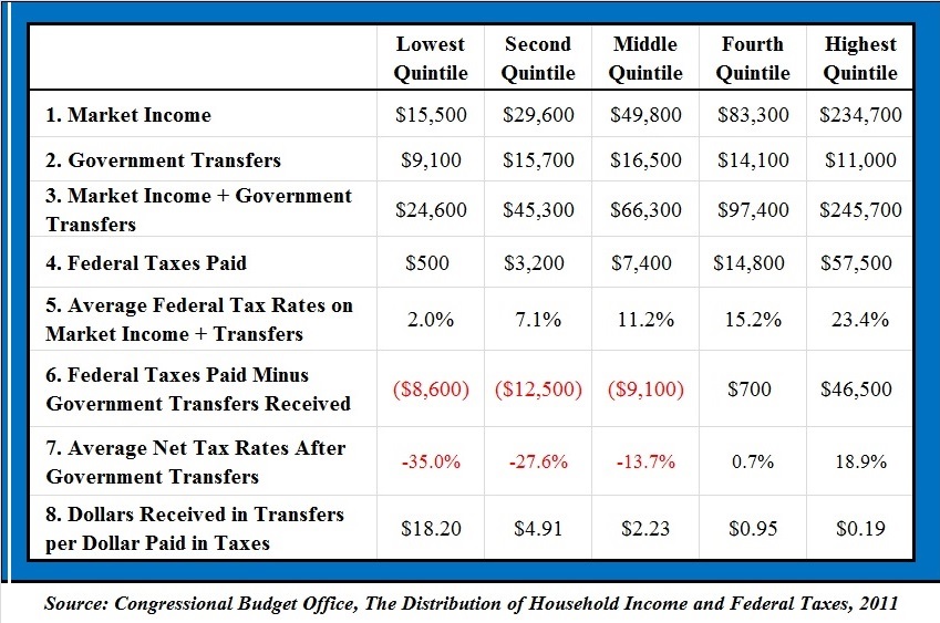
Since I’m an accountant, I naturally tied the amounts on lines 1 through 4 back to table 1 of the CBO report (since I’m an auditor, also can’t avoid saying without exception). I recalculated the amounts on lines 6 and 7, again without exception.
I calculate that the top quintile pay over 98% of the net amounts paid: 46,500 / (46,500 +700) = 98.52%.
What about the top 1%?
If that is a question you would like to ask, I sincerely suggest you reeeeealy don’t want to open up that discussion.
I eyeballed figure 1 of the report. Looks like about 33% of all federal taxes paid come from the 1%. About 45% of all taxes paid come from the 2% to 20% of top income households. Spreading that to an average, the top 1% pay 33% of all federal taxes. Each of the next 19 percentiles pay on average 2.4% of all federal taxes.
Go back to the average of $57,500 taxes paid by the top quintile. If there were 20 people paying that amount on average, that would be a pool of $1,150,000. One would pay about 42%, or 486,450 (33 / {33 + 45} = 42.3%). The remaining 19 would pay 662,550 or about 34,900 each.
Table 3 says the top 1% get 1% of their income from transfer payments. The next 19% get 3% of their income from transfers.
I’m not going to extend that out, but the result would likely be that the far biggest chunk of the net payments would be from the 1%.
So, two conclusions. First, the top 20% of earners are paying essentially all of the federal taxes net of transfer payments and the bottom 60% of households are getting money back on average. Second, looks to me like the top 1% are paying over half of the total net taxes paid.
0 Comments